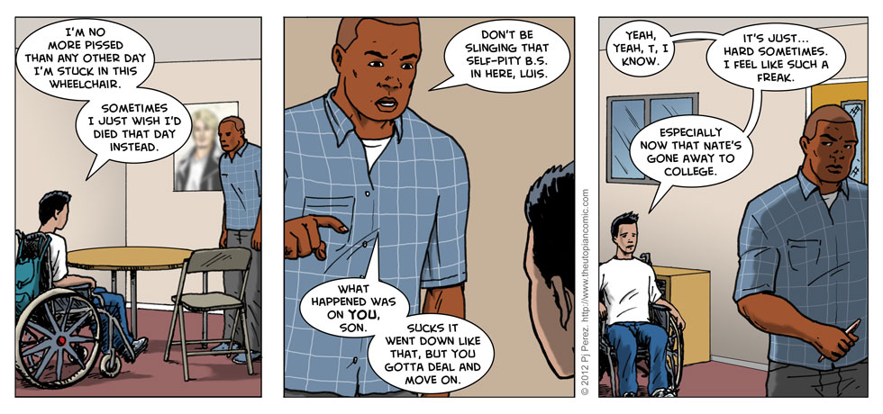
Self-Pity
Fun fact: I’m still making small tweaks to these strips from their original appearance. Small stuff. Both tightening up the script and tightening up the lettering, at which I’d like to think I’ve improved over the years. When I first started working on comics digitally, I did (like many beginners) my lettering in Photoshop, which seemed to make sense, since I was working on the artwork there anyway. Keep it all in one place, right? But Photoshop is not great for comics lettering (or really any other sort of page design/layout)–it’s too inflexible, and if you’re intending to ever print your comic, working in raster as opposed to vector format will hurt you in the end.
That said, I started this all-Photoshop and all the files still are in that format, and no way am I re-lettering it all in Illustrator unless I absolutely have to, so … I’m fixing what stylistic things I can along the way, and not worrying about the rest. I mean, I like the “look” of the lettering for The Utopian (both series), so why muck with it?
Anyway, here’s the original commentary to this strip from April 23, 2012:
My original script had a lot of “realistic” use of foul language, but I’m trying to keep this strip as all-ages friendly as possible while still maintaining its complex characters, themes and adult situations. In the first Utopian series, I used asterisks to blot out expletives, but I kinda hate that, because you know what the word is, and all I’m doing is impeding your reading.
That said, I was watching a lot of “The Wire” while writing the first 40 strips, so who knows?


Discussion ¬